17.12.25.Congratulations to Dhanya, winner of our Logo competition! The results were announced in a news item here.
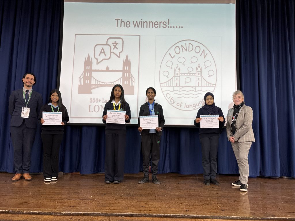
Dhanya’s design is on the left, and Dhanhya is smiling ear to ear (or as Ms Louot put it “Dhanya avait un sourire jusqu’aux oreilles”) – she’s in the middle of the photo – rightly so! What an achievement.
What inspired your design process, Dhanya?
“Tower Bridge is more than just a feat of Victorian engineering; it is the ultimate symbol of a city that thrives on connection. When I set out to design my logo, I knew this landmark had to be the centerpiece. While it physically joins the north and south of London, its true power lies in how it connects a kaleidoscope of cultures, backgrounds, and identities. When we zoom out and look at the overall picture, we can see the 2 towers communicating in different languages; this symbolises diversity. The strap line of “300+ languages” is a message that describes how London is special because of the variety of different society and languages. In conclusion, my logo is a symbol of connection between languages and its importance.”
An image perfectly captured in words. Thank you, Dhanya.
How does learning a language help young people, Ms Louot?
“Learning another language opens doors our pupils don’t yet know exist but it also expands our pupils’ worlds. Language learning is not just about words and vocabulary, it’s about gaining confidence, gaining cultural awareness and understanding as well as being able to connect with people beyond their own communities. It is about expanding opportunities and preparing them to thrive in an increasingly global community.“
We love the image conjured up by ‘doors which we don’t yet know exist’. Thank you Ms Louot!
Congratulations also to the talented pupils whose logos were commended. We loved them all!
To read about Elizabeth, joint winner, see the Bishop Thomas Grant page here.